Branding
Project InVictus Branding
Logo design aimed at defining the core values of Project InVictus, a brand about fitness and nutrition for those who are ready to train not only their muscles but also their will to learn something new every day.
- Role Designer
- Type Branding

It was in the first quarter of 2019 that Project InVictus started aiming at making its cores values more clear and accessible. Project InVictus wants to change the status quo in fitness with a proper revolution and to do so, it needed a stronger and more impactful branding with its focus on community and fitness “rioters”.
The fitness core revolution

Project InVictus is a movement based on building a new revolution from the ground up. Project InVictus is the movement of the modern hoplites. It echoes the images and the fights of the ancient Greeks by projecting them ont the modern scenario.
While working out, everyone is fighting, everyone is trying to reach new highs. This fight for improvement need to be respected and finds in Project InVictus its core hub.
Logo design Project

The logo design project was divided into three parts:.
- Brand Identity and statements
- Logotype and pictogram design
- Applications and Brand Identity Book

Logotype
The chosen typeface was Gotham Tobias Frere-Jones, one the greatest type designers still alive and operating in the field. Gotham really embodies Project InVictus core values, with its simplicity and its origins derived from the vernacular usage of typefaces through the cities like Manhattan.
It’s a community and political typeface, oriented at expressing the feeling from the lower strata of society.
V stands for valor

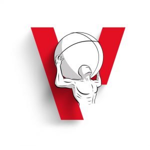
The new pictogram is the classic V of Project InVictus, designed as a revolution symbol. It was simplified to be more accessible and legible on screens.
Legibility was one of the main focus of the project. A proper revolution symbol needs to be easy to ready, recognize and practical to remember and reproduce.
The V was split into its components to better convey the sense of urgency and movement while drawing it – immediately usable by everyone. The lack of a part of the stroke makes it recognizable and dynamic while also conveying one of the core values of the brand: the need of change through the deletion of unfounded notions (doxae).
Brand Book

The new identity was then developed consistently throughout the main touch points of the brand: print, digital and events. A brand book was assembled to have a clear statement about who we are and what we want to change in the status quo.
What I learned
Designing a brand Identity for a on-going big brand with so many products can be intimidating at first because of its impact. I learned a lot along the way. Most importantly I learned how essential it is for a brand like Project InVictus to closer with its community and to provide them a clear statement of values. I think finding someone else with the same values and fight for them together is really precious.
