Product design
Fitness Posturale UX in Print
UX design doesn't only belong to UI design but to most design fields, even the most traditional one like print.
- Role Product Designer
- Type Product design
Fitness Posturale is an innovative book about fitness and postural exercises for professionals. It gave me the opportunity to work on something traditional and to keep the eyes less focused on the result on screen and more on the printed paper. It could have been developed as a simple graphic design project but UX design was taken into consideration to design a book that is not only nice to look at, but also easy to study from and to quickly navigate between chapters and sections.
Make complexity look simple

Fitness Posturale is really a complex book. It’s divided into two volumes and features graphs, tables, images and many different kinds of sections. What proved to be essential was keeping consistency (between sections and compared to other books from the same brand) in mind while also designing specific layouts to display different kinds of content.
Even though there were many kinds of content arrangement, unity was necessary as much as specificity. The reader has to find the book easy to read, consistent but also specific and tailored made for the currently-read section.
Many chapter featured these inner sections:
- Exercise Book: these sections were full of exercises. Every exercise has one or more pictures, a short description and some related information like rest, repetitions and tips. Exercises are presented in different plans to provide solution for specific postural issues.
- Exercise Dictionary: these sections feature single exercises, not part of a specific plan. It provides the reader an easy way to quickly get to know everything about an exercise or simply show it to the person they take care of. It’s purpose it’s similar to that of a dictionary
- Case studies: these sections showed the effects of specific plans through the presentation of real case studies.
Design Solution


The final design provides:
- A specific structure to show content with repeating features (such as always the same icon for repetitions)
- A consistent way to highlight notes, sources while also making them not standout too much
- Colored labels on the side of the page so that the user can see where each section is even when the book is closed
Off-topic: Ads used to show main product features


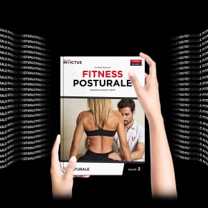
Fitness Posturale immediately faced some communication issues when compared to other products of Project InVictus line-up. Differently from other books, this one has a higher-positioning in terms of price and value. It’s also bigger, more feature rich and more robust. The main issue though was that this brand store is only digital and makes it easy to understand the differences.
That way all the ads and display images always feature this book as it was held by hands to show actual scale.